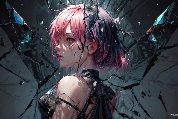
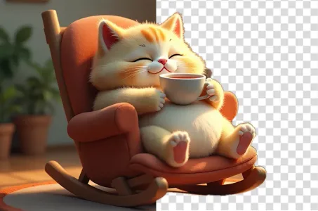
For a cover design that is clearly distanced and uses a Korean manhwa style and
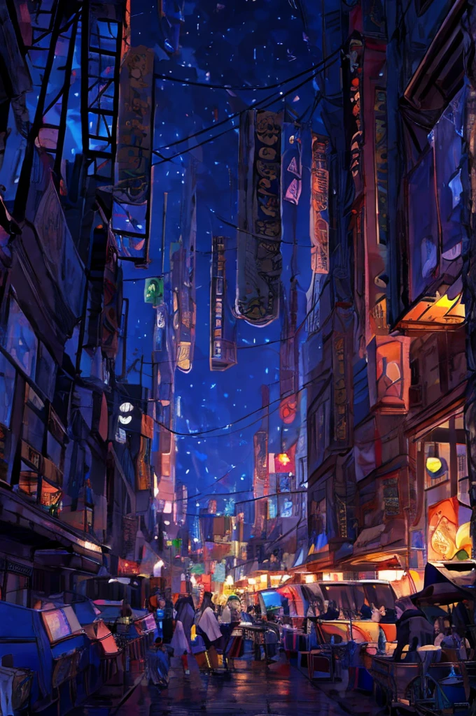

Há coisas que só podem ser ditas aqui, está pronto?
For a cover design that is clearly distanced and uses a Korean manhwa style and looks sharp and realistic, you can follow this guide.: Background Scene: Divide the image in half: should have one half for the man and the other half for the woman, using images that depict different settings, such as the man in a dark room with computer screen lighting, while the woman is in a cooler, more colorful room. The arrangement: with a clear separation of the composition, such as using a dividing line or different colors in each half. The: man: Use a manhwa style that conveys loneliness or discouragement. The female character: characters should use a style that conveys a sense of distance or disconnection from the man. The posture and facial expressions of the characters should communicate a feeling of distance and separation. The additional elements: man: may have digital devices like a computer or game monitor that are dimmed down. Female: may have elements that reflect coldness, such as cold decorations. Use light and shadow to emphasize the feeling of separation and alienation. Color tones: should use contrasting color tones to emphasize the difference, such as dark colors for the man and cool colors for the woman. Use lighting from different sources to enhance the distinct feelings in each half. The placement: The image is divided into two halves: should have the man sitting in a dark room filled with digital equipment on the left, and the woman in a room with a cold, detached feeling on the right. Use a dividing line or contrasting background colors to emphasize the sense of separation and distance. Use light and shadow to accentuate the cool and introspective atmosphere. Use different color tones in each half of the image, such as black or dark blue for the man and cool or gray tones for the woman.
Prompts
Copiar prompts
For a cover design that is clearly distanced and uses a Korean manhwa style and looks sharp and realistic, you can follow this guide.: Background Scene: Divide the image in half: should have one half for the man and the other half for the woman, using images that depict different settings, such as the man in a dark room with computer screen lighting, while the woman is in a cooler, more colorful room. The arrangement: with a clear separation of the composition, such as using a dividing line or different colors in each half. The: man: Use a manhwa style that conveys loneliness or discouragement. The female character: characters should use a style that conveys a sense of distance or disconnection from the man. The posture and facial expressions of the characters should communicate a feeling of distance and separation. The additional elements: man: may have digital devices like a computer or game monitor that are dimmed down. Female: may have elements that reflect coldness, such as cold decorations. Use light and shadow to emphasize the feeling of separation and alienation. Color tones: should use contrasting color tones to emphasize the difference, such as dark colors for the man and cool colors for the woman. Use lighting from different sources to enhance the distinct feelings in each half. The placement: The image is divided into two halves: should have the man sitting in a dark room filled with digital equipment on the left, and the woman in a room with a cold, detached feeling on the right. Use a dividing line or contrasting background colors to emphasize the sense of separation and distance.
Use light and shadow to accentuate the cool and introspective atmosphere.
Use different color tones in each half of the image, such as black or dark blue for the man and cool or gray tones for the woman.
INFO
Checkpoint & LoRA
comentário(s)
1
0
0


