Create a highly cohesive design that fully integrates the visual traits of all p

할 말이 있어, 살짝 이야기해줄게, 관심있어?
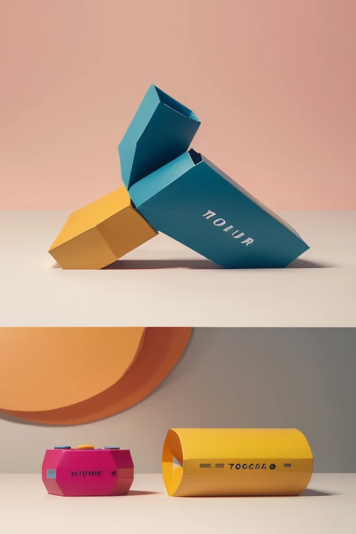
Create a highly cohesive design that fully integrates the visual traits of all provided images. Use a color palette with 40% bright, warm pink as the dominant base, especially in backgrounds and key elements, 20% vivid yellow for accents and highlighting critical components, 15% dark blue for contrast in typography and shapes, 10% soft beige for neutral balance, 10% bold red for emphasis on small but impactful areas, and 5% olive green for natural undertones. The layout should combine 60% flat, playful illustrations with 40% realistic mockups, especially of product packaging such as food containers, stickers, and cereal boxes, giving the design depth and texture. Ensure that the typography is varied but coherent, mixing bold, uppercase sans-serif fonts (60%) and serif fonts (40%), with occasional distortions for a whimsical effect. Most surfaces should be flat and matte (70%), with some glossy elements (30%) to create a tactile contrast. Maintain a geometric, blocky, and simple style, avoiding unnecessary detail but focusing on clarity, sharpness, and volume. The design should evoke a playful yet commercial branding aesthetic, with a mix of artificial, animated elements and precise, clean digital lines. The overall composition should feel modern, saturated, fun, and perfectly balanced between branding visuals and illustration-heavy creativity, echoing the strong use of color and typography across all the referenced images.
프롬프트
Copy prompts
Create a highly cohesive design that fully integrates the visual traits of all provided images. Use a color palette with 40% bright, warm pink as the dominant base, especially in backgrounds and key elements, 20% vivid yellow for accents and highlighting critical components, 15% dark blue for contrast in typography and shapes, 10% soft beige for neutral balance, 10% bold red for emphasis on small but impactful areas, and 5% olive green for natural undertones. The layout should combine 60% flat, playful illustrations with 40% realistic mockups, especially of product packaging such as food containers, stickers, and cereal boxes, giving the design depth and texture. Ensure that the typography is varied but coherent, mixing bold, uppercase sans-serif fonts (60%) and serif fonts (40%), with occasional distortions for a whimsical effect. Most surfaces should be flat and matte (70%), with some glossy elements (30%) to create a tactile contrast. Maintain a geometric, blocky, and simple style, avoiding unnecessary detail but focusing on clarity, sharpness, and volume. The design should evoke a playful yet commercial branding aesthetic, with a mix of artificial, animated elements and precise, clean digital lines. The overall composition should feel modern, saturated, fun, and perfectly balanced between branding visuals and illustration-heavy creativity, echoing the strong use of color and typography across all the referenced images.
0개의 댓글
1
0
0


