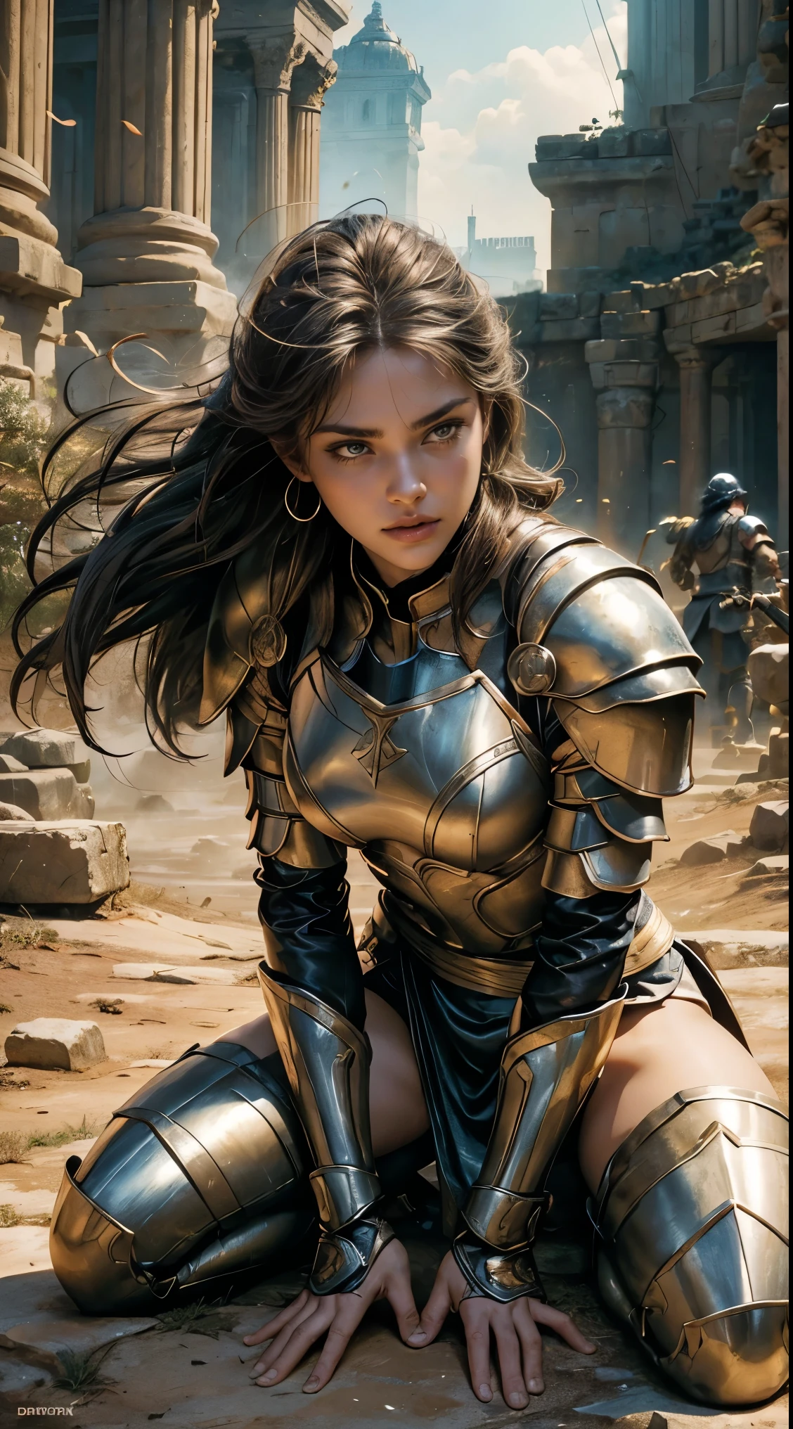
A woman in armor poses on a rock in front of a building

Tengo sugerencias atrevidas, ¿te atreves a escuchar?
The photo is a parody movie poster for "Gladiator II,"* a sequel to the critically acclaimed film *"Gladiator."* the break down its artistic style and composition in detail: ### Composition: - **Focus on the central figure**: The most prominent part of the image is a southeast asian female gladiator kneeling on one knee at night. The gladiator’s armor, and body language are highlighted, giving a sense of tension. Her hand is firmly gripping a plastic prop sword, suggesting readiness for battle. The framing of her body, particularly the arms, draws attention to her power and determination. - **Close-up, dynamic angle**: The low angle of the shot amplifies the character’s dominance and presence. The slightly tilted perspective adds to the intensity of the scene, making the viewer feel as though they are looking up at a heroic figure. - **Muted background**: Behind the central figure, the background is somewhat blurred and toned down, keeping the focus entirely on the gladiator. The environment seems to be dusty or hazy, like a construction site, with warm, earth-toned colors. ### Color Scheme: - **Warm hues and lighting**: The image predominantly uses a warm, amber-colored lighting that bathes the scene, casting an almost nostalgic glow. This effect emphasizes the setting of ancient times and creates a golden, heroic ambiance. The light source appears to be from above, casting soft shadows that define the character's form and armor. - **Earth tones**: Shades of brown, beige, and tan dominate the color palette, reinforcing the ancient, rugged setting. These colors are often associated with the earth and the natural world, aligning with the film’s themes of survival, grit, and combat in primitive conditions. ### Symbolism: - **Armor and attire**: The gladiator is wearing what appears to be traditional Roman armor, suggesting a historical time period and directly connecting the film to its ancient Roman context. The details of the armor are less ornate and more fun
Prompts
Copiar prompts
The photo is a parody movie poster for "Gladiator II,"* a sequel to the critically acclaimed film *"Gladiator."* the break down its artistic style and composition in detail:
### Composition:
- **Focus on the central figure**: The most prominent part of the image is a southeast asian female gladiator kneeling on one knee at night. The gladiator’s armor, and body language are highlighted, giving a sense of tension. Her hand is firmly gripping a plastic prop sword, suggesting readiness for battle. The framing of her body, particularly the arms, draws attention to her power and determination.
- **Close-up, dynamic angle**: The low angle of the shot amplifies the character’s dominance and presence. The slightly tilted perspective adds to the intensity of the scene, making the viewer feel as though they are looking up at a heroic figure.
- **Muted background**: Behind the central figure, the background is somewhat blurred and toned down, keeping the focus entirely on the gladiator. The environment seems to be dusty or hazy, like a construction site, with warm, earth-toned colors.
### Color Scheme:
- **Warm hues and lighting**: The image predominantly uses a warm, amber-colored lighting that bathes the scene, casting an almost nostalgic glow. This effect emphasizes the setting of ancient times and creates a golden, heroic ambiance. The light source appears to be from above, casting soft shadows that define the character's form and armor.
- **Earth tones**: Shades of brown, beige, and tan dominate the color palette, reinforcing the ancient, rugged setting. These colors are often associated with the earth and the natural world, aligning with the film’s themes of survival, grit, and combat in primitive conditions.
### Symbolism:
- **Armor and attire**: The gladiator is wearing what appears to be traditional Roman armor, suggesting a historical time period and directly connecting the film to its ancient Roman context. The details of the armor are less ornate and more fun
0 comentario(s)
0
9
0


